Whispered Light, Confident Luxury
Begin with a Gentle Base
Ambient that Breathes
Task without Tension

Accent as a Whisper

Warm Dim That Feels Human
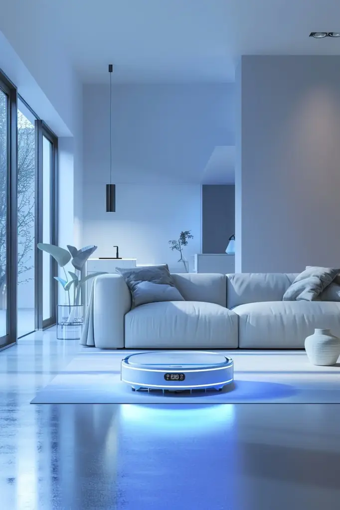
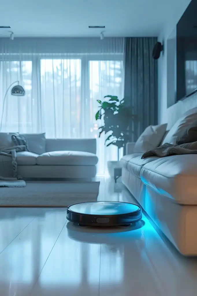
As evening deepens, let technology mimic firelight. Warm-dim LEDs slide from a fresh 3000K toward a buttery 1800–2200K, cueing the body to unwind. Skin tones soften, polished metals mellow, and reflective surfaces become friendlier to the eye. When light color lowers alongside brightness, rooms gain emotional depth, and intimate gatherings feel timeless rather than staged by bright, unyielding electric whiteness.
Finishes That Glow, Not Glare
Quiet luxury favors finishes that catch light softly. Choose satin brass, bronzed metals, honed stone, and open-weave linens to diffuse reflections. Avoid mirror-like surfaces near stronger sources to prevent visual hotspots. Frosted diffusers and alabaster shades create an aura rather than a spike of brightness. The aim is a tender, luminous envelope that flatters materials without announcing the fixture as the main attraction.
Color Rendering for Truthful Tones
When woods, textiles, and art matter, demand high fidelity. Look for LEDs with CRI 90+ or, better, strong TM-30 metrics that maintain color balance and saturation. Reds, skin tones, and nuanced pigments should remain honest across dimming levels. Good rendering prevents that waxy, flattened look and ensures collections and cabinetry feel authentic. Under accurate light, investment materials repay attention with rich, natural presence.
Architecture as the Luminaires’ Silent Partner

Rhythm, Health, and the Day’s Quiet Arc
Morning Clarity
Afternoon Focus
Evening Unwind
Controls, Scenes, and the Art of Effortless Ease

Stories from Quiet Rooms


All Rights Reserved.